
I'll be honest, when I started making digital wall art six years ago, I assumed people would just download, print, and hang. Done. But the questions I kept getting told a different story. What size should I print this? How do I pick frames? Does this Medusa print go next to my plant shelf or is that weird? Fair questions, all of them. So here's everything I've figured out about styling printable wall art at home, mostly through my own trial and error (and a few holes in the wall I'd rather forget).
Start With the Wall, Not the Art
Most people pick a print they love and then try to find somewhere to put it. I used to do the same thing. But the better approach is the reverse: look at the wall first. Where's the empty space that keeps bugging you? Above the couch, over the bed, that blank hallway you walk past every morning? That's your starting point. Measure it. Even a rough measurement with your phone is fine.
Once you know the space, choosing the right print size gets a lot less stressful. A good rule I keep coming back to: your art should fill about two-thirds to three-quarters of the wall space above a piece of furniture. So if your couch is 200cm wide, you're looking at roughly 130-150cm of art across that wall, whether it's one large print or a cluster of smaller ones.
Picking the Right Print Size
One of the best things about printable wall art is that you're not locked into one size. Every print at Maison Succes comes with 5 high-resolution files (300 DPI), each optimized for a different print ratio. That means one purchase covers over 25 frame sizes. You just pick the file that matches your frame.
Here's how the ratios break down: 2:3 fits frames like 8x12", 16x24", and 24x36". 3:4 covers 9x12", 12x16", and 18x24". 4:5 is your go-to for the popular 8x10", 16x20", and 24x30" frames. There's also an ISO file for A1 through A4 sizes, and an 11x14" file. Quick example: if your frame is 16x20", grab the 4:5 ratio file.
You can always print smaller than the max size listed with no quality loss, but don't go larger or it'll get blurry. Here's how I think about choosing a size:
For big, empty walls: Go large. A single oversized print, like a Greek statue photograph or an abstract piece, can anchor a room the way a piece of furniture does. Don't be afraid of scale. A tiny print on a big wall just looks like you forgot to finish decorating.
For shelves and side tables: Smaller prints (5x7, 8x10) work well leaning against a wall or propped on a stand. They're low-commitment and easy to swap out when you feel like a change.
For gallery walls: Mix your sizes. I usually recommend picking two or three different sizes and arranging them in a loose grid or cluster. More on that below.
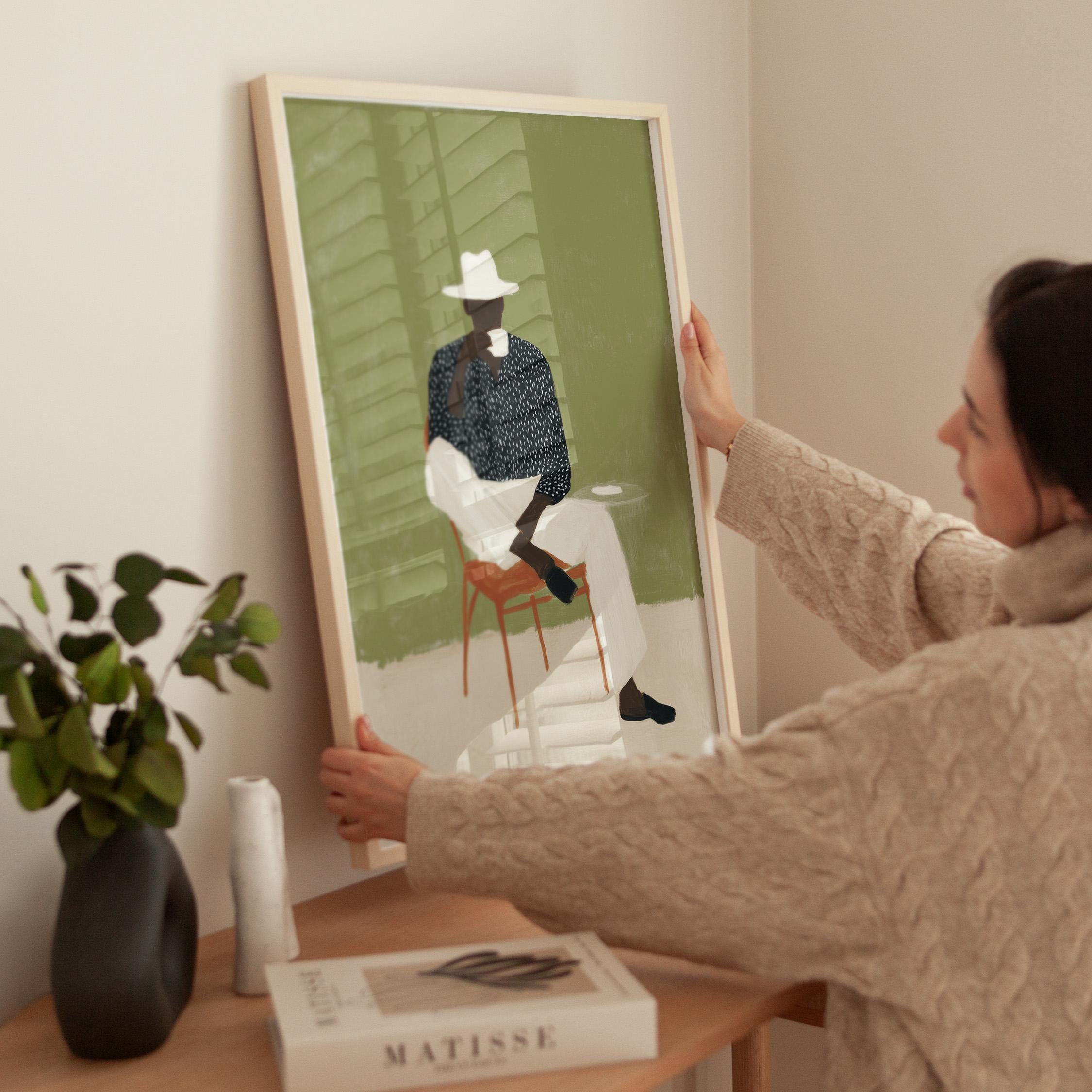
Frames Change Everything
This is the part where people get stuck, so I'll keep it simple.
Black frames are the safe bet. They work with almost any print style and any room. If you're not sure, go black. I have black frames in my own apartment and they make Greek mythology prints look clean and modern without competing for attention.
Natural wood frames warm things up. If your space leans Scandinavian or has a lot of neutral tones (beige walls, linen furniture), a light oak frame adds warmth without being loud.
White frames are trickier than people think. They can look great on dark or coloured walls, but on a white wall they tend to disappear. If you want the art to float, that's fine. But if you want definition, pick a colour with some contrast.
No frame at all? Also valid. You can get prints mounted on foam board or just clip them to a wire with binder clips for that studio-apartment look. And here's a trick I wish someone told me earlier: mats (the border between the frame and the print) make cheap frames look expensive. A wide white mat around a print instantly gives it a gallery feel, even if the frame cost you five euros at a thrift shop.
Building a Gallery Wall That Doesn't Look Chaotic
Gallery walls are everywhere right now, and for good reason. They let you tell a story with your space. But they can also go sideways fast if you just start hammering nails. What I've found works:
Pick a thread. It doesn't have to be a strict theme, but some kind of visual connection helps. Maybe it's a shared colour palette: warm neutrals, black and white, terracotta tones. Maybe it's a subject, like mixing classical sculpture prints with Mediterranean photography. The point is that the eye should move across the wall and feel like everything belongs together, even if the individual pieces are different.
Lay it out on the floor first. Seriously, this saves so many extra nail holes. Arrange your prints on the floor or a bed to get the spacing and composition right before anything goes on the wall. I do this every single time, even now.
Keep spacing consistent. About 5-8cm between frames looks intentional. Anything tighter feels cluttered, anything wider and they start looking like separate pieces rather than a collection.
Start from the centre. Hang your largest or most important piece first, slightly below eye level (about 145cm from the floor to the centre of the piece). Then build outward.
Mixing Art Styles Without It Looking Random
This is where it gets fun. You don't need every print to be the same style. In fact, a wall with five identical-looking pieces can feel a little flat. In my shop, I've got everything from Matisse-inspired abstract prints to classical Greek statue photography to olive branch still lifes. They're very different styles, but they can absolutely live on the same wall if you give them something in common. Usually colour. A Medusa sculpture print in dark, moody tones next to a warm Mediterranean landscape might sound like a clash, but if they share a similar earthy palette, they feel like a conversation rather than an argument.
The combo I see customers pull off most often: one statement piece (something bold, maybe a classical sculpture or a large abstract) surrounded by two or three quieter, simpler prints. It gives the eye a place to land and then somewhere to wander.
Rooms and What Works Where
Living room: This is where you can go bold. Large-scale prints, gallery walls, statement pieces above the sofa. Living rooms can handle drama.
Bedroom: I'd lean toward calmer pieces here. Soft abstracts, muted photography, things that don't demand too much attention when you're trying to wind down. Neutral tones like creams, soft greys, dusty olive tend to work well.
Home office: This is personal, but I like having something with a bit of presence in my workspace. A classical bust or a detailed architectural print gives the room a sense of intention. It also makes your video call background look a lot more interesting than a blank wall.
Kitchen and dining area: Smaller prints work well here, usually something warm. Think olive branches, vintage-feeling still lifes, Mediterranean scenery. Art in the kitchen shouldn't feel precious. It should feel lived-in.
Hallway: Underrated space for art. A narrow hallway is actually perfect for a vertical series: three prints in a column, or a long horizontal panoramic. It gives people something to look at on the way through.
The Actual Printing Part
Since everything in my shop is a digital download, you'll need to get it printed. Every purchase comes with a guide PDF that walks you through it, but here's the short version.
Print at home if you have a decent inkjet printer. Use thick matte photo paper (32 lb or heavier) or premium cardstock. The key thing: set your printer to 100% scale and turn off "Fit to Page" or "Scale to Fit." Those settings will resize your file and mess up the dimensions. You want the print to come out at the exact size of the file.
Local print shop is my go-to recommendation. Bring your file on a USB drive or email it ahead. Ask for matte photo paper or fine art paper, and tell them "no scaling." Any local print shop or photography lab can handle this, and the results are usually better than home printing for larger sizes.
Online print services like Printify let you upload the file and have it shipped to your door. This is the most hands-off option if you don't want to deal with printing or framing yourself. For the best gallery-quality result, go with matte or fine art paper, pick a simple clean frame that works with your room, and add a white mat border. That mat is what gives it that museum-quality look, and it costs almost nothing extra.
One Last Thing
The best wall art advice I can give you is this: don't wait for perfection. I've seen people agonize over placement for weeks and end up with blank walls because nothing felt "right." Put something up. Live with it for a few days. Move it if you need to. Art at home should make the room feel more like yours. That's it.
There are no rules that can't be broken, no wrong combinations that can't be swapped out tomorrow. If you're looking for prints that mix classical sculpture, Mediterranean photography, and modern design, come take a look at Maison Succes on Etsy. Everything's an instant digital download. Pick a print, print it, frame it, done.